Anubhav18h
About page, story section this time.
Kept most of the writing in the copy itself, headline does the work. Just added founded year and a short paragraph under it, nothing more.
Didn't need to overdesign this one.

Web Designer & Framer Developer | Building thoughtful websites for startups | Open for commissions
About page, story section this time.
Kept most of the writing in the copy itself, headline does the work. Just added founded year and a short paragraph under it, nothing more.
Didn't need to overdesign this one.
Noren is now live.
A premium Framer template for architecture studios, property developers, real estate firms, and creative practices.
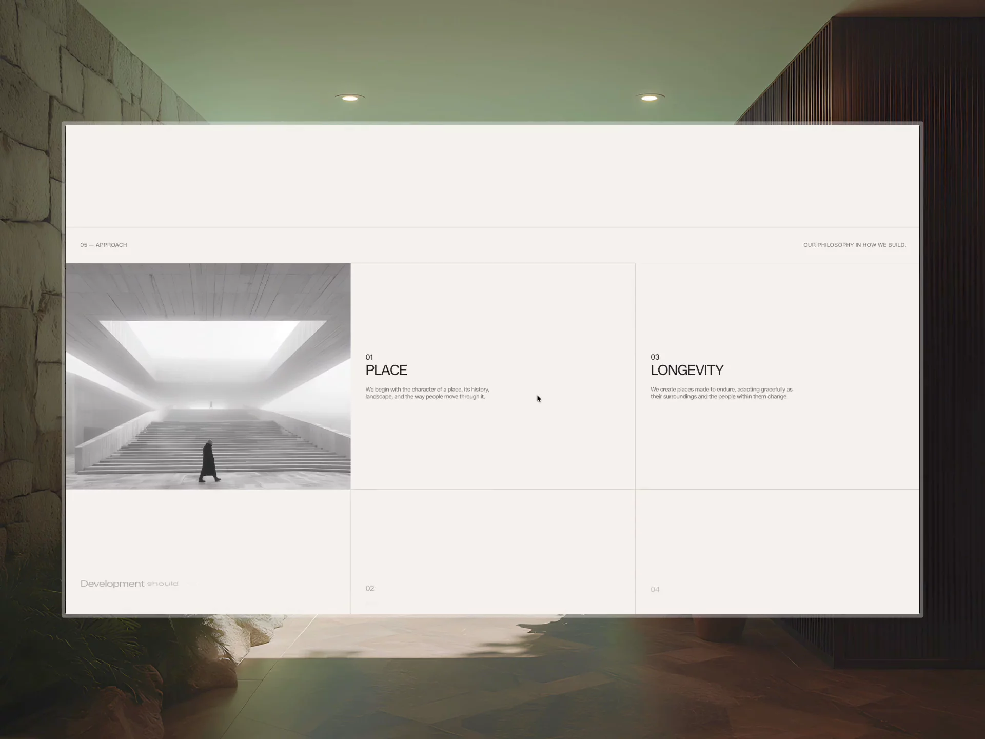
I wanted to build something that felt more like an architecture publication than another real estate website.
Large imagery, editorial typography, considered spacing, project storytelling, and a CMS structure designed around the work.
Been going back and forth on how to lay out Noren's practice section.
Tried cards first, then a grid, and nothing felt right honestly
Ended up just going with a plain numbered list, big numbers, etc. Way simpler than what I was trying before.
Should've started here tbh.
404 page for Noren, using the map/coordinates thing for this one instead of a plain error page.
Enjoyed experimenting with this theme honestly.
Working on Noren now, construction/development brand.
Here is the Cta Footer Design for that.
How is it?
Okay this is the last Plinth post from me for a while, moving on to the next project after this.
If you've been seeing these all week and haven't grabbed it yet, still free, here you go.
Okay this is the last Plinth post from me for a while, moving on to the next project after this.
If you've been seeing these all week and haven't grabbed it yet, still free, here you go.
Recording this two weeks after shipping Plinth, just never got around to showing the responsive side.
The hero especially worried me going in. Holds up fine though, still feels clean at every width.
Attention to detail is just doing this part properly.
Journal CMS for Plinth, index and detail page both.
Went with actual article structure on the detail page instead of one long block of text. Feels like reading something instead of scrolling a landing page.
It's free btw.
This studio page was mostly about getting the rhythm right. I wanted each section to feel like a natural step into the next. wdyt?
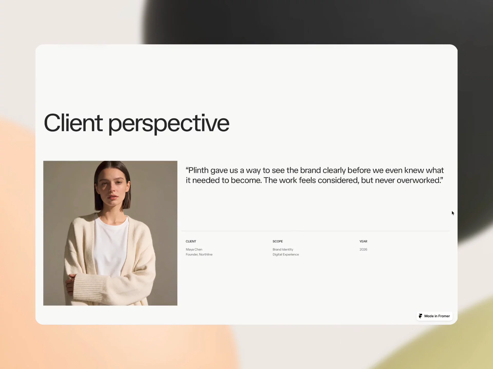
This is one of the case study pages from Plinth.
Didn't add much structure to it. Editorial photography was already strong enough on its own.
Came out cleaner than expected.
This is one of the case study pages from Plinth.
Didn't add much structure to it. Editorial photography was already strong enough on its own.
Came out cleaner than expected.
Work cms index page.
Each project gets two images, year, and deliverables listed plainly beside it. No cards, no borders.
Just paper, basically.
Contact section, full page this time.
Form up top, then how the process actually works, then answers to the obvious questions.
It's from Plinth, free to grab.
Small update to the homepage.
Every visual had a slight orange tint over it. Removed it — reads clearer.
Also added Reson and Plinth to the collection.
Added two new case studies to the portfolio — Reson and Plinth.
Actually broke down the decisions this time. Problem, key tradeoffs, why I built it the way I did.
Worth a look if you're into the process, not just the polish.
No "404" anywhere on this page.
Skipped the number entirely, wrote a real headline instead.
Feels weird not seeing "404." Good weird or bad weird?
Most creative agency websites look the same right now.
So I built a free Framer template that doesn’t.
Editorial typography, image-led layouts, CMS pages, and a proper design system underneath it.
Finally updated the profile photo. Not hiding anymore👀
Most grids like this just sit there. No motion, no feedback.
Added hover states on every card. Quick, tuned by hand, not just a default transition.
This is the level I build at now.